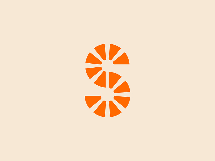
Sunganics Logo Mark
Brand mark designed for Sunganics, a sustainable household cleaning brand that offers subscription-based products with plastic-free packaging, and non-toxic natural ingredients.
Our goal was to come up with a bold, distinct S mark that would connect to the geometry of the custom logotype (see below) while reflecting the meaning behind the brand name, sun + organic. Our solution consisted of a symmetrical and geometric S composed of sun rays.
bold
bright
cleaning
detergent
eco friendly
environmental friendly
hand wash
home
home goods
household
laundry
non toxic
orange
packaging
paper
personal care
products
recyclable
refill
sustainable
View all tags
Posted on
May 2, 2024
More by Necula Creative View profile
Like


